Matching entries matching “seen” from KELP - graffiti meets design

...clásico de clásicos.

Desde la editorial alemana Hatje Cantz nos llega Meditated Vandalism - Gen Atem
Del artista europeo Gen Atem tenemos en las manos un libro muy interesante.
Gen Atem es uno de los pioneros del graffiti en Europa. Además del arte urbano en movimiento.

De gran trayectoria este artista trabajó con gran parte de lo más selecto del graffiti en Nueva York. Seen, Rammellzee entre otros han formado equipo para Exposiciones y eventos.
Meditated Vandalism es una monografía sobre el artista y su nuevo rumbo. Esta ves nos enfrentamos al vandalismo ordenado. Algo así como ordenadamente improvisado.
El artista se enfrenta al cuadro, con algun motivo preimpreso, para después atacarlo y bien activarlo con un golpe de pintura.
Una excelente idea para generar dinamismo y frescura.

De la misma firma para generar discusión y debate. Nos enfrentamos al cuadro, a la identidad del personaje retratado.
Meditated Vandalism tiene naturalmente su trasfondo en cuanto a si la globalización es benigna o maligna. Nos destruye y nos deja totalmente sin identidad?
El libro está dividido en varios capítulos que enmacan su trabajo:
- The Three Jewels
- Royal Blood
- Flowers
- Sensation
- How To Execute an Sentence
- Pages
- Rock/Stars
- etc.
Terminamos con un ensayo del artista y finalmente un resumen de su hitoria con las clásicas imágenes antiguas de jóvenes pintando, reuniendose y dibujando y exponiendo.

Meditated Vandalism es un libro sumamente activo y dinámico.
Meditated Vandalism lo puedes encontrar directamente acá.

...década de los '80.


De la editorial alemana Prestel nos llega este increible libro titulado "Agua" (Wasser) del autor Bernhard Edmaier.
Tal como el título ya lo dice el elemento natural del Agua nos marca en este planeta como ningúna otra fuerza. De forma líquida, congelada o gasificada forma nuestro paisaje día a día de diferentes formas.

El autor nos presenta en un librazo de 240 páginas imágenes aereas del Agua en diferentes lugares del planeta.
Sin agua no tendríamos los valles, no habría montañas ni cumbres a escalar como tampocolas playas, litorales o dunas y desiertos.
Si la pensamos bien, sin agua no estariamos acá.

"El agua es una sustancia cuya molécula está formada por dos átomos de hidrógeno y uno de oxígeno (H2O). Es esencial para la supervivencia de todas las formas conocidas de vida. El término agua generalmente se refiere a la sustancia en su estado líquido, aunque la misma puede hallarse en su forma sólida llamada hielo, y en su forma gaseosa denominada vapor. El agua cubre el 71 % de la superficie de la corteza terrestre. Se localiza principalmente en los océanos, donde se concentra el 96,5 % del agua total, los glaciares y casquetes polares poseen el 1,74 %, los depósitos subterráneos (acuíferos), los permafrost y los glaciares continentales son el 1,72 % y el restante 0,04 % se reparte en orden decreciente entre lagos, humedad del suelo, atmósfera, embalses, ríos y seres vivos. El agua es un elemento común constituyente y que pertenece al sistema solar, hecho confirmado en descubrimientos recientes. Puede encontrarse, principalmente, en forma de hielo; de hecho, es el material base de los cometas y el vapor que compone sus colas.
Se estima que aproximadamente el 70 % del agua dulce se destina a la agricultura. El agua en la industria absorbe una media del 20 % del consumo mundial, empleándose en tareas de refrigeración, transporte y como disolvente de una gran variedad de sustancias químicas. El consumo doméstico absorbe el 10 % restante."
Fuente: Wikipedia

En KELP.cl queremos mostrar estas hermosas imágenes y presentar este libro dado la belleza y la relación que tiene con nuestro trabajo de embellecer el entorno: urbano o natural.
Podemos aprender mucho de estas imágenes, del trabajo de la naturaleza con el agua y de sus composiciones.
Con texto científicos de la Dr. Angelika Jung-Hüttl se describen en este libro los procesos geológicos que suceden detrás de las imágenes presentadas. Por lo tanto no es solamente imágenes bonitos, sino que son imágenes con un texto explicativo complementario.
Muy recomendable, un excelente regalo.
El libro "Wasser" lo puedes encontrar directamente acá.


Mademoiselle Maurice is a French street artist whose creations are unlike anything you've ever seen.
While most artists use spray paint to bring color to the walls and sidewalks of cities, she spends days folding and assembling origami into colorful creations in urban areas.
She learned the ancient art of paper folding in Japan and was inspired to create art by the 2011 Tokyo earthquake.
Se viene el próximo estreno de la secuela de Style Wars.
About Style Wars 2
Style Wars 2 is a Graffiti documentary produced by Veli and Amos, a
Swiss-Slovenian artist duo. The movie is a sequel of the cult movie
"Style Wars" from 1983 and gives an update on today's Graffiti and
Street Art scene, in a very unique and entertaining format.
30
years after the release of Style Wars, the movie that helped spread the
graffiti movement from New York around the world, Veli and Amos, the
producers and main protagonists of Style Wars 2, hit the road to
discover new graffiti styles and meet the artists behind. A wild journey
takes them from Europe to New York and the Middle East, from galleries
to war zones.
The movie is a well-quoted homage to the original
Style Wars movie and at the same time tells the personal story of Veli
and Amos. Even though the movie's main focus is on graffiti, it
approaches the topic in a much broader way, and also alludes to
politics, art and lifestyle.
Small Talk with Veli & Amos
Urban Art NOW: For those that don't know you, who are Veli & Amos, and what inspired you to do Style Wars 2?
Veli & Amos: We have been working as an artist duo since 2008. We
both studied art and we regularly present our work in galleries all over
the world as well as in public space. Style Wars 2 is our first feature
film.The only inspiration to do a project like this came, when we first
saw the Style Wars 1 film. We used the quote the movie over and
over..We started to film our friends at first and then slowly a story
developed organically..
Urban Art NOW: Can you explain the significance of the original Style Wars?
Veli & Amos: Style wars is a cult movie.Everybody who cares about graffiti has seen Style Wars or Wild Style.
Urban Art NOW: What has been the general response (then) of two guys
from Slovenia and Switzerland making a sequel to a movie that holds such
an enormous cultural relevance?
Veli & Amos: We watched Style
Wars so many times that we knew it by heart. We saw parallels and
relations between 30 years before and today..We were motivated to
capture the styles and philosophy of contemporary and old school
writers. By exploring those connections we found new stories and
positions that are not present in Style Wars.
Years ago when we
showed the first raw cut of the film to Henry Chalfant, he was sceptic
about it. But after watching it, he just fell in love with the project
and since then he is supporting us..
Our close friends thought its a joke because it took us so long time to finish it.
We could also see the public response after we published 2 trailers on
Youtube. Many people didnt't believe its happening, they thought its
impossible to make Style Wars 2. If we look 5 or 6 years back, we would
probably think the same.. But we did it!
Urban Art NOW: You guys did make sure to have all the OG's on board, when can we expect Style Wars 2 to be available worldwide?
Veli & Amos: During the past 5 years, we filmed over 100 hours of
footage, simultaneously developing the story board, with support of our
friends and editors Jan Gassmann and Adrian Aeschbacher. The movie was
realized without support of a professional production company nor a big
budget, instead we founded "No Money Production. Style Wars 2 is our
personal view on graffiti today, our aim was not to cover or make a
statement about worldwide graffiti.We are still searching for right
people who are interested to distribute the film in their own countries
or world wide.
Urban Art NOW: Last question: what is the craziest adventure you guys had while shooting the Style Wars 2 footage?
Veli & Amos: We had many adventures its hard to pick up one.
Meeting Henry Chalfant, Blade, Seen of course. Our personal travel
adventures, struggeling and sneaking through without money. But probably
our trips to Israel and Palestine were the most intense..
Interview by Alex Pope

WOW!
El artista Nathan Ota presenta su primer libro con las obras de su primera Exposición en USA.
De la editorial norteamericana Zero+ Publishing la publicación "Ikiru" es alucinante.

Nathan Ota es un artisa o bien ilustrador con las raices en el graffiti. Pintando influenciado por películas como la clásica Wild Style, el pintor seguía los pasos de grandes grafiteros como Seen.
Con el paso del tiempo fue adquiriendo su propio estilo llegando a lo que vemos actualmente en el libro y en este post.
La verdad es que es un libro hermoso. Los trabajos son preciosos y perfectos en su composición y técnica.

Junto con Risk (otra leyenda de por esos lados) crearon algunos cuadros que de seguro a cada uno de ustedes estimados lectores le gustaría tener en su casa.
Un trabajo surrealista, un mundo ficticio y muy fantasioso es lo que Nathan Ota ofrece en sus pinturas:
Árboles que viven y personajes con cabezas iluminadas son algunos de los personajes que vemos en sus cuadros.

Me gustaron en especial la composición y las ideas. Hay todo un diálogo en cada cuadro...situaciones que a veces hacen reir y/o pensar. Genial!
El libro combina en la primera parte lo que es la historia del artista. Con ejemplos de sus primeros graffiti y sus primeros bocetos de letras con todos los elementos que todos ocupábamos en los 80 y 90. Flechas, rayos, 3d, etc.

....hay algo de Tim Burton en el estilo. Creo que para los fans de Burton, Ota debe ser algo que necesitan revisar.
144 páginas a todo color. Muy hermosa selección y trabajo de diseño en el libro.
Recomendable!
El libro, limitado a 1000 copias, lo puedes encontrar directamente acá.

Todo sucedió por aquellos años de inicios de la década de los setenta, fines de los sesenta en la ciudad de Nueva York y en la ciudad de Philadelphia....la historia es conocida.
Graffiti rápidamente se convirtió en uno de los fenómenos más influyentes de la historia del arte contemporáneo. Realizado por en su época niños y jóvenes para ellos mismos, este libro nos cuenta esa época. Entretenido es leer las anécdotas y lo que tienen que contar gente como Taki 183, Joe 182, Snake 1, Blade, Ale One, Iz The Wiz y muchos más...


Un libro interesante en donde podemos acercanos un poco más a la historia y a los inicios del graffiti sobre trenes en NYC. Nunca está demás saber un poco más de donde viene nuestra cultura que practicamos a diario.

via: mymodernmet.com
David Mach is an artist who loves using new and different mediums. We've seen him make an enormous King Kong and a crucifix out of thousands of wire hangers. Now, the artist impresses us once again by using another common household material, the matchstick.
The first part of the process involves designing a form, often done by having a plastic model made from a clay mold. Many of the matches are imported from Japan for their colored heads. Then the task of sticking each matchstick onto the figure begins.
Depicting both real and fictional characters, Mach's sculptures are an array of dynamic looking figures. From Betty Boop, Charlie Chaplin, and even Marilyn Monroe, all of the matchstick art pieces are stunning.
Mach sells some of them at galleries and auctions, but others are destined to be set aflame and burnt down at exhibitions. After all the time spent creating these pieces, I couldn't even imagine setting them on fire!

The history of the Crochet
Tree It's about 10 years that I
live far away from my home, my culture. After some years I realised to start to
forget my language. For fighting this horrible fact I'm reading more in
hungarian. This winter I've found some unknown poems from one of the most famous
hungarian poets, Sándor Petőfi and immediately felt in love! He used several
times rainbow and spiderweb motifs in his works. Who ever seen my flickr knows
well that I'm "obsessed" with both of them! @;) After some times when
I returned home I went to my city's theater with my Mom. The name of this
theater is Petőfi Színház. Yet another time him, I've tought! The recitation
was shocking (in the right way): A Midsummer Night's Dream's adaptation from
William Shakespeare. At the end I felt like a forest creature in a fairytale!
As we were exit I've seen a tree in front of the theater. It was strange, nude,
"devious"... And I finally understood what do I have to do: Dress up
the Petőfi Színház's tree with Sándor Petőfi inspired rainbow crochet spiderwebs
for give him a fairytale look! During the crocheting progress
I've found myself wondering... How to answer to children when they are asking
me: how is it possible that a tree is rainbow coloured? So I wrote a little
fairytale for them, just for fun. I'm a crocheter NOT a writer! Be indulgent!
%) : Once Rainbow said: Every work of mine are based on numerology and colour therapy. This tree contains 13 colours
(which means 39 colour combinations). 13 because of the 13 chakras. I've found
a site times before and I'm happier since I've seen that all the Oversoul
Chakras are rainbow colored! @;) Toda una teoría de Babukatorium.
"I've already seen the whole world, I appear for some minutes here and
immediately I have to run to another place... I'm tired, I would like to go on
holiday!"
In April it was raining with sunshine several times, so Rainbow visited
Veszprém and felt in love with the city. There were colorful flowers everywhere
and people were kind. From the sky it seemed like a beautiful, quiet little
city. As Rainbow was looking around she've seen a lonely tree in a park rounded
by red tulips. People were walking hand in hand under him, children were
playing near to the tree and Rainbow could hear also the music from the theater
next to the park. She was envy for the moveless peace of that tree, for the
closeness of people... And she tought:
"I want to stand like that tree! I want to be a part of people's life for
awhile! This should be the perfect holiday for me!"
So Rainbow said goodbye to the sky and came down to hug tightly the tree!
(Don't worry, Rainbow's sisters and brothers are still trevelling all over the
world and Rainbow will return to work too after the relaxing holiday!)
Here is the link for it:
www.holographicsound.com/chakra-colors.html
I started to install it on May 3rd 2011, with new moon in taurus.
3 months for crochet, 3 days for installing 247 spiderweb circles. Number 3 and
13 returns everywhere in this project!
The colours are following from red to violet like chakras and they are
installed like the snake (Kundalini) is going up to the tree.

Foto: Osgemeos®
más info acá:
MOCA PRESENTS ART IN THE STREETS APRIL 17-AUGUST 8, 2011
Art in the Streets will showcase installations by 50 of the most dynamic artists from the graffiti and street art
community, including Banksy (London), Fab 5 Freddy (New York), Lee Quiñones (New York), Futura (New York),
Margaret Kilgallen (San Francisco), Swoon (New York), Shepard Fairey (Los Angeles), Os Gemeos (São Paulo),
and JR (Paris). MOCA's exhibition will emphasize Los Angeles's role in the evolution of graffiti and street art, with
special sections dedicated to cholo graffiti and Dogtown skateboard culture. The exhibition will feature works by
influential local artists such as Craig R. Stecyk III, Chaz Bojórquez, Mister Cartoon, Robbie Conal, RETNA, SABER,
REVOK, and RISK.
A special emphasis will be placed on photographers and filmmakers who documented graffiti and street art
culture including Martha Cooper, Henry Chalfant, James Prigoff, Steve Grody, Gusmano Cesaretti, Estevan Oriol,
Ed Templeton, Larry Clark, Terry Richardson, and Spike Jonze. A comprehensive timeline illustrated with artwork,
photography, video, and ephemera will provide further historical context for the exhibition.
Art in the Streets will feature several shows within the show. There will be a special section dedicated to the
Fun Gallery, which connected New York graffiti artists with the downtown art community in the early 1980s. Co-
curated by gallery founder Patti Astor, the Fun Gallery installation will feature the work of Keith Haring, Jean-Michel
Basquiat, and the graffiti artists who shaped the gallery's history. A section dedicated to the seminal film Wild Style
(1983), co-curated by the film's director Charlie Ahearn, will document its influence on the global dissemination of
graffiti and hip-hop culture. The exhibition will also feature a memorial presentation of Battle Station, a rarely seen
work by legendary artist and theorist RAMMELLZEE, and a display of graffiti black books and other historic works
from the Martin Wong Collection presented in collaboration with the Museum of the City of New York. A highlight
of the exhibition will be a Los Angeles version of Street Market, a re-creation of an urban street complete with
overturned trucks by Todd James, Barry McGee, and Steve Powers.
The exhibition will open with a skate ramp designed by pro-skater Lance Mountain and artist Geoff McFetridge.
Skate demonstrations by the Nike SB skate team will be held on Thursday and Saturday afternoons.
"Art in the Streets will be the first exhibition to position the work of the most influential artists to emerge from street
culture in the context of contemporary art history," said MOCA Director Jeffrey Deitch.
"This quintessentially urban and dynamic partnership between the Brooklyn Museum and MOCA began with the
2005 Brooklyn-organized exhibition of the work of Jean-Michel Basquiat, the consummate American street artist of
his generation; continued with the MOCA-organized ©MURAKAMI in 2007, defining critical elements of worldwide
street art; and now culminates with a groundbreaking exhibition devoted entirely to street art and graffiti," said
Brooklyn Museum Director Arnold L. Lehman. "The partnership has, in itself, provided a major record of public art
over the past half century."
Art in the Streets is organized by Jeffrey Deitch and associate curators Roger Gastman and Aaron Rose. Gastman
is the author of The History of American Graffiti, which will be released in April 2011, and was a consulting
producer on the film Exit Through The Gift Shop. Rose curated the exhibition Beautiful Losers and directed the
related documentary film. Ethel Seno, editor of Trespass: A History of Uncommissioned Urban Art, is the curatorial
coordinator of the exhibition. The Brooklyn Museum's presentation will be organized by Managing Curator of
Exhibitions Sharon Matt Atkins.

From Dre Urhahn and Haas&Hahn of Favela Painting:
"Our latest work in Rio de Janeiro. It's called Praça Cantão and spans over 34 houses, covering 7000 square meters. We are slowly moving towards our goal: painting an entire favela and we're getting closer and closer.
Over the last month, Praça Cantão, the square at the entrance of the community of Dona Marta was turned into a vibrant artwork of monumental scale. 34 houses on the giant hillside favela, located in the center of Rio de Janeiro, have been painted in a design of colorful rays, radiating into the city. This 7000 square meter artwork is part of the 'Favela Painting' project by Haas&Hahn (Jeroen Koolhaas and Dre Urhahn), a project that aims to transform communities into landmarks and inspirational monuments as a part of Rio's image, next to the statue of Christ the Redeemer and Sugar Loaf mountain.
Realization of the artwork is largely driven by the inhabitants of Dona Marta. 25 local youth have been trained as painters, providing for their own income and being responsible for turning their own neighborhood into a colorful monument. This grassroots method of working has proven to be successful in earlier projects, and gives the local community empowerment, pride and color. The local team is complemented by three painters from another favela, Vila Cruzeiro, where two of the previous projects by Haas & Hahn took place.
The project has thusfar been financed through grants and donations, but a co-operation with the dutch paint company AkzoNobel might open new doors. A meeting with their Managing Director Tex Gunning, showed they had a shared vision. "They wanted to give color to the community", Dre recalls, "and we wanted to give art to the community. I see no reason why we cannot recreate this idea across 300 houses, 3000 houses, whether its in Rio, Johannesburg, Mumbai or anywhere in the world."
About Favela Painting
In 2006, the Dutch artists Jeroen Koolhaas en Dre Urhahn conceived the
idea of creating community-driven art interventions in Brazil. Named
'Favela Painting', their first efforts yielded two murals which were
painted in Vila Cruzeiro, Rio's most notorious slum. The first mural is
entitled 'boy with kite' and has a surface of 150 m2. The second mural
proved to be more challenging, with a surface of 2000 m2. Painted on a
staircase in the heart of Vila Cruzeiro, it depicts a flowing river with
Koi Carp fishes in the style of a Japanese tattoo, designed together
with Rob Admiraal. The artworks for the murals are painted in
collaboration with the local youth. Training and paying them as
painters, learning them the tricks of the trade and empowering them by
contributing to the development of the artwork. These projects received
worldwide press coverage and have become points of pride both within the
community and throughout Rio.
Using a grassroots-based bottom-up approach has proven to be a key factor in the success and final results. In order to generate support and approval for their activities, the artists always make the favela their home. By spending their time within the local community, they're able to connect to their surroundings more easily, winning the hearts and minds of people. In their point of view, the inhabitants of the favela are a legitimate part of the city, but not seen that way from the outside. Using these beliefs, they work with the locals to paint the artworks, literally helping them changing the face of their community. Over the years, inhabitants of the favela's have become aware of this method, and are actively requesting their favela to be turned into an artwork. As one woman from Vila Cruzeiro put it: 'I've never been to a museum in my life, and now I'm living in one'.
Favela Painting is supported by the Firmeza Foundation in the creation of striking artworks in unexpected places. It collaborates with the local community to use art and color as a tool to inspire, create beauty, combat prejudice and attract attention. The Foundation facilitates the worldwide realisation of art interventions, and looks after their maintenance. It also develops relevant spin-off projects in the areas of education, socio-economic / social support and development of local people involved in the projects.
As of March 2010, Favela Painting has established a collaboration with AkzoNobel's decorative paint division. Based on their mission of "adding colour to people's lives", AkzoNobel intends to participate in an inspiring and meaningful manner in local communities in the countries in which it operates. The objective of the cooperation between both parties is to realise worldwide, large scale "community driven" works of art. Works of art that make a colourful difference in the lives of individuals, groups, communities and cities. Works of art that have the potential of inspiring others elsewhere, that leave an indelible impression and can work as a catalyst in the processes of social renewal and change.
via wooster.
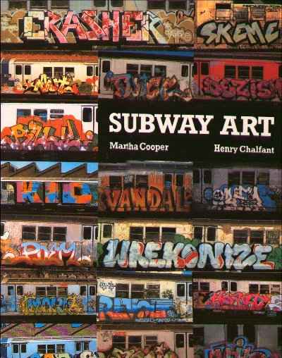
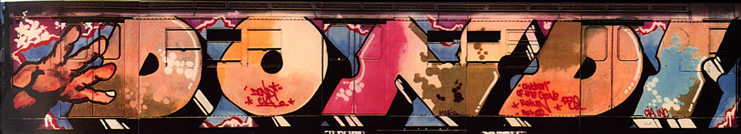
Han pasado muchos años....sobre 25 años para sumergirnos nuevamente en estas clásicas imágenes de los trenes pintados en Brooklyn, en Dondi pintando un whole car y en Seen tapizando trenes y en Lee haciendo historia.
Esta vez en Subway Art "edición de aniversario" hablamos de un libro del doble de tamaño que la primera edición y con las imágenes a página completa!!
Y con varias imágenes que no encontraron espacio en la primera edición ahora las puedes disfrutar por completo. Naturalmente que el whole car de Dondi "Children of the Grave" está en DOBLE PÁGINA! como también trenes de Blade y de Seen.
La verdad es que las 128 páginas de este libro son en realidad casi 64 afiches de la historia del graffiti en Nueva York, USA.

Subway Art, del cual ya se ha escrito todo pero que siempre aparece como referencia obligada para entender el fenómeno del graffiti nos muestra y explica las cosas fundamentales que debemos saber (que alguien fuera del mundo del graffiti también debiera conocer) y lo ilustra con imágenes, textos y citas.
Subway Art en su edición de aniversario de 25 después de haber aparecido por primera vez, no contiene ninguna de las citas y de los textos anteriormente nombrados. Es una gran guía fotográfica y un resumen completamente gráfico del graffiti en NYC. Por lo tanto veo a este increible libro como un complemento a su versión anterior.


Para entender el fenómeno del graffiti antes que nada es salir a la calle a observar y alimentarse directamente con material visual "in situ". Pero para entender el fenómeno también hay que ver la historia, su evolución, su nacimiento y entender por que pasó todo. Mal que mal es por eso que actualmente tenemos toda esta "bomba" de material gráfico urbano en cada rincón del planeta. Algunos ocupan ciertos libros para remitirse a lo que pasó hace mil años y así entender la actualidad. No por nada llamo a Subway Art la biblia del graffiti. Con la primera edición vemos y logramos entender lo que hizo el graffiti ser graffiti y aparecer (nacer).


Con la segunda edición complementamos la información con imágenes, con imágenes mas grandes, de ideal resolucion y calidad. Situaciones, trenes, esquinas, movimientos, aires y colores que describen por que, como y donde nace uno de los fenómenos culturales y una de las manifestaciones urbanas más grandes y radicales de la historia.
Recomendable!
KELP

Genial investigación del movimiento del graffiti.
"En la actualidad gracias a las capacidades de procesamiento que se poseen se analiza todo lo que se nos va ocurriendo, Graffity Analysis es un estudio en curso en donde se analiza el movimiento del graffiti donde gracias a un software se produce visualizaciones del movimiento en la creación de una firma."
via Linwind.


Un gran blackbook o una gran croquera es como mejor puedo definir lo que es The Piecebook. En sus dos ediciones "Piecebook: The secret drawings of graffiti writers" y la recientemente lanzada segunda edición "Piecebook reloaded: rare graffiti drawings" los autores Sacha Jenkins y David Villorente nos llevan en un viaje a hacia la década de los '60 en adelante.
Pero vamos por parte. La idea principal de Piecebook es recordar y mostrar a la gente como comenzó y cual era la importancia de las croqueras en el mundo del graffiti. Los denominados sketchbooks o blackbooks eran cuadernos para dibujar que los grafiteros llevan consigo a todas partes para desarrollar en ellas su estilo propio de letras y caracteres.
En 1965 en adelante los sketchbooks fueron de vital importancia por que con ellos el escritor de graffiti se daba a conocer, era su bitácora de vida. De alguna forma sigue siendolo hoy en día, a pesar de que el PC haya ganado mucho terreno en cuanto al dibujo y diseño de letras.
Con esta perspectiva en mente las croqueras de los grafiteros eran uno de los bienes más preciados por cada uno de ellos. Y poder dibujar en la croquera de otro grafitero, un símbolo de reconocimiento y respeto por el trabajo hecho. Así, rápidamente de una se pasaba fácil a 10, 20 croqueras por grafiteros llenas de dibujos, de práctica de letras, de colores que posteriormente iban a ser transformados en realidad en los trenes y paredes de las ciudades (Philadelphia, Nueva York al principio).
El primer libro "...The secret drawings of graffiti writers" inicia este documental impreso con lo que fueron los bocetos de destacados grafiteros, vigentes en la actualidad gran parte de ellos como Seen, Cope, Daze, etc. Bocetos, croquis, dibujos simples y complejos, con colores o b/n.
Lo que hace especialmente alucinante este libro (en realidad ambos) es que la calidad de impresión y del papel es exactamente igual (en un 99,9%) a los bocetos originales. Un ejemplo es que la tinta de los lápices muchas veces traspasaba el papel y manchaba el otro lado. Pues bien, este libro rescata también esos detalles.
Simplemente alucinante!
El segundo libro "reloaded: rare graffiti drawings" es cuasi la continuación del primero. Esto significa que los dibujos van desde 1985 hasta el 2005. Sigue la misma línea del primer libro y la exclusividad de los bocetos y dibujos es igual de alta.
Con una definición de primera clase, empastado y tapa dura, PIECEBOOK es de esos libros de graffiti especiales y únicos que no recopilan imágenes por recopilar sino para marcar y destacar algo esencial de la cultura del graffiti. Y con la calidad que esta se merece.
Gracias a la distribución de la editorial Prestel pueden encontrar estos dos libros en Amazon o bien en su librería más cercana (a pedido).
Recomendable!
KELP
foto 1 por aquí y foto 2 por aquí.

Pronto a ser inaugurada el grafitero Seen, leyenda del graffiti en USA, prepara los últimos detalles. Más acá.
Via.

Feed Subscription
If you use an RSS reader, you can subscribe to a feed of all future entries matching “seen”.